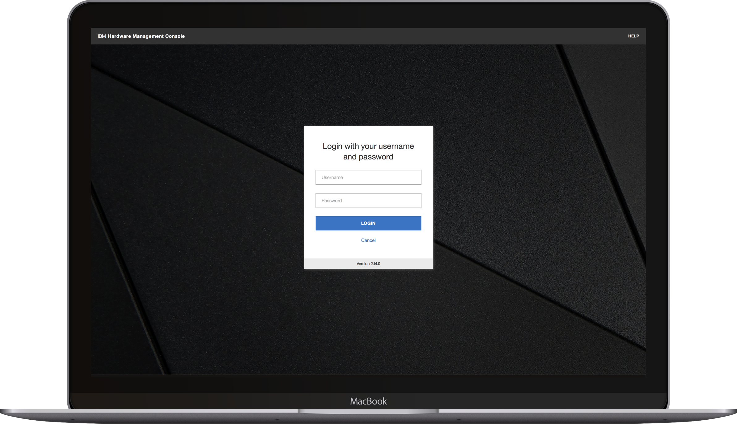
IBM Hardware Management Console
UX Design
Overview
IBM Z mainframes sit in data centers around the world providing the digital infrastructure for much of the modern world. Every time you swipe your credit card, take a flight, or use your insurance, chances are your data or transaction went through an IBM mainframe.
The Administrators who keep mainframes running have a stressful and demanding job where system failures mean millions of dollars lost and customers frustrated. The IBM Hardware Management Console (HMC) is a powerful but old desktop web application that Admins rely on to keep their systems running. Our team was tasked with modernizing the overall experience and define a new visual language.
Role
My primary role was making strategic design changes that elevated the overall user experience across the product for all users. I was one of two UX Designers on this project on a team of six Designers and Developers. I also helped define the visual language with our Visual Designer and create prototypes for user testing with our Design Researcher.
Embracing Complexity
The best way to think about the IBM Hardware Management Console is as an operating system with hundreds of applications that allow Admins to manage their systems. Each of these applications were designed and developed by engineers over the past few decades, many without thoughtful consideration of the end user experience.
Our biggest challenge was figuring out how to approach such a large and complex product and have a meaningful impact in our timeframe.
Our Approach
We took a two pronged approach for this project. The first was a top down look at how we could elevate the overall user experience for every user using the app on a daily basis, which was my main responsibility.
The second was a bottom up redesign of a large workflow that would be used as a framework for similar work to come afterwards, which the other UX Designer on our team was responsible for.
Our Users
Through our research we uncovered two personas: Easton the older experienced Admin and Adele the younger inexperienced Admin.
A Fresh Perspective
Our first approach to identify focus areas for the top down look was learning how to use the Hardware Management Console ourselves and documenting all of our pain points. Though we weren't our users, we embodied aspects of one of Adele, our millennial persona.
User Research
We went through a process of talking to users of different experience levels from a wide range of companies that represented all of our customers. Using quantitative data from logs, we began to understand high level patterns. We also performed interview sessions to gather qualitative data on what aspects of the product users had the biggest pain points with.
Balancing the Old & New
The challenge that would become the theme of this project was to appeal to older expert users and cater to the younger novice user at the same time. Many of our users have used the product for decades, knew how to work it, and avoided change. But our other group of users saw the experience as a relic of the past that was frustrating to use.
This meant that many of our users didn't really know what they wanted and we had to develop methods to help them think outside of their box by prototyping ideas and putting them in from of them.
Design Changes
Tabbed Organization
The old interface had new tasks opening in separate browser windows.
The HMC used an outdated pattern of opening new tasks as separate browser windows, meaning that users often juggled more than four windows to complete what should be straightforward workflows. Ideally we would redesign every workflow, but that would be like redesigning every screen on your banks website in less than a year, not a realistic goal.
The new design provides easy access to all open tasks without switching between windows.
Instead, I designed a tabbed interface that automatically groups related tasks to help users stay organized. This flattened interface is borrows from web browser interaction patterns, making it a familiar experience.
The new design with a task popped out into a separate window.
To provide flexibility we allow users to easily pop tasks out into separate windows when they need to compare data and similar scenarios. This ended up being one of our users’ favorite changes across the board.
Favorites
Early in our research we found that most users only used a small subset of the features on the HMC. However, to launch a task users had to open a list of up to 156 tasks and scroll through to find what they needed.
The Tasks Index of the old design forced users to scroll through a list of up to 156 tasks to find the few they actually use.
This led us to implement a user curated favorites list, enabling them to access their frequently used tasks without needing to navigate back to the Tasks Index
The new user curated favorites list.
Search
Addressing a similar problem as favorites, we designed a universal search that allows users to quickly find and launch tasks. Because novice users often forget the specific names of tasks, we use metadata to display related tasks to help them find what they need.
Search in action.
Reception
I've shown only three of the many changes we made to the Hardware Management Console. Many of the others laid the groundwork to start pulling together other parts of the product in future releases. The feedback has been overwhelmingly positive from both experienced and novice users, especially around the tabbed organization and search.


